


Implementation
Modernise an existing frontend
We restructure a defined part of your existing frontend to make it easier to maintain while preserving the agreed user behaviour.
We build recurring interface elements as shared code components, with defined variants, states and documentation.
Your enquiry is non-binding. An order is created only when you accept our quotation .

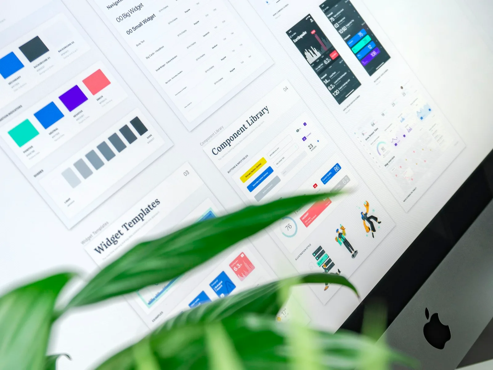
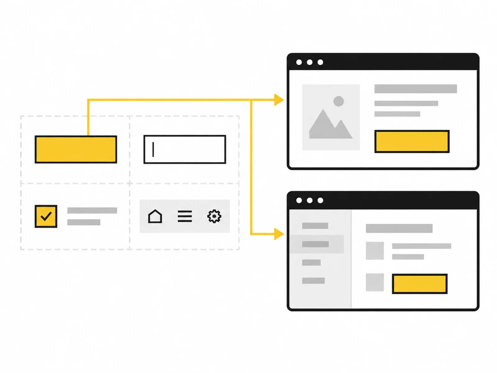



Image 1 of 4
A component library contains shared code blocks for recurring elements. Changing an input field's error handling, for example, can reach every view using that component.
The package is limited to up to eight components and their agreed states. Selection follows genuinely recurring tasks. An existing design system supplies visual rules. The library is documented with examples and used in one representative flow.
A component is not good merely because it offers every imaginable setting. Too many options make use and maintenance harder. We define its purpose and the variants actually needed. Arbitrary special parameters do not conceal differences between components.
Interaction matters as much as appearance. A field needs a label and error association; a dialog needs a clear focus flow. Requirements are agreed for each component. Documented examples show correct composition.
Separate implementations can diverge in focus, errors or loading states. Shared components make agreed behaviour traceable.
Colours and spacing alone do not create a reusable interface. The library connects existing design rules with specific components.
Documented examples support further development. They explain when a component fits and which combinations are deliberately unsupported.
We compare existing views and define up to eight components. Variants, states and a representative integration case are explicitly described.
Components are implemented in the agreed stack. A local overview shows permitted variants, content and interaction states.
A specific integration checks whether component APIs fit everyday use. Handover explains extension, maintenance and areas not yet migrated.

The library provides a shared foundation for agreed components. Existing pages do not automatically use them; further migration needs planning.
Reuse does not eliminate every kind of effort. Maintenance, version changes and new requirements remain tasks whose ownership the team should clarify.
Describe what already exists: design, website or application. A specific journey with the views and states to develop or change is useful.
We then clarify which technology the site uses, where changes are tested and how they reach you. We also discuss missing content. Do not send repository tokens or production credentials through the enquiry form.
What is included, what do you need and what happens after your enquiry?
The process in detail →An existing visual system is required. The package translates selected rules and components into code; brand development and a full Figma library are excluded.
A defined building block with agreed variants and states. A complex calendar is not equivalent to a simple text field and is scoped appropriately beforehand.
A local overview is included. The suitable tool depends on the existing project; new infrastructure is not assumed without a concrete need.
One representative flow is included. Further pages are not silently migrated; scope depends on special cases and technical dependencies.
This package covers one agreed frontend stack. Multiple frameworks require separate implementations and tests, adding scope.
We confirm the start and delivery deadline in writing after reviewing your documents. The agreed scope and complete source data determine the schedule.
Approved design rules, component list and existing stack Example views and agreed keyboard and state requirements Credentials must not be included in the enquiry. Details are agreed only after written commissioning.
One written follow-up round is included. The service scope lists the analyses, designs or technical changes covered by the package. We agree additional work with you before it begins.
Maintaining the same form field in several places: choose shared building blocks, integrate them into a real journey and adopt them gradually.
Read the guide ↗We restructure a defined part of your existing frontend to make it easier to maintain while preserving the agreed user behaviour.

We turn an approved design into a responsive website or landing page that works on small and large screens.