NISTA-IT GmbH
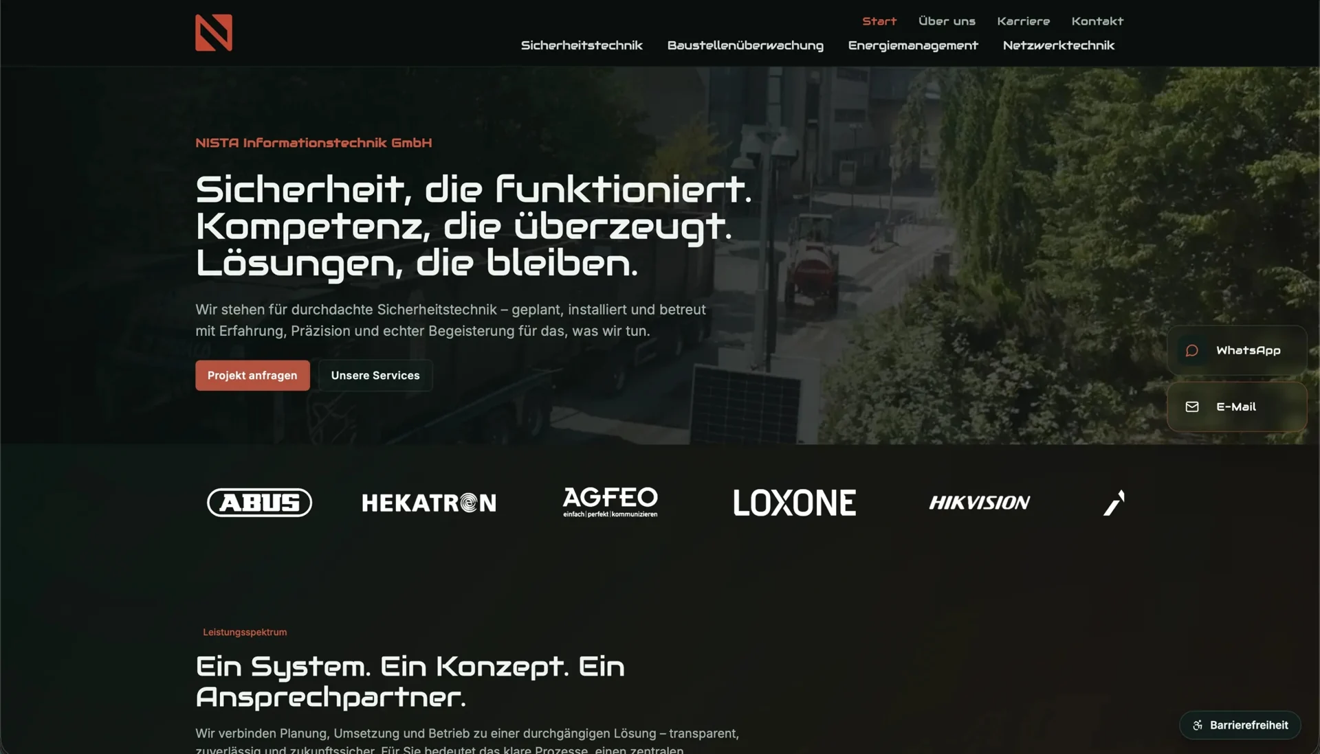
A home, a commercial building and a construction site each call for different IT solutions. We developed the brand and website for NISTA-IT GmbH together, helping visitors find the relevant service and enquire about their project.
- Challenge
- Present security systems, energy management, networks and construction monitoring clearly under one brand.
- Our contribution
- Brand design, information architecture, responsive interfaces and website development.
- Result
- A consistent identity with dedicated service pages and direct routes to a relevant enquiry.
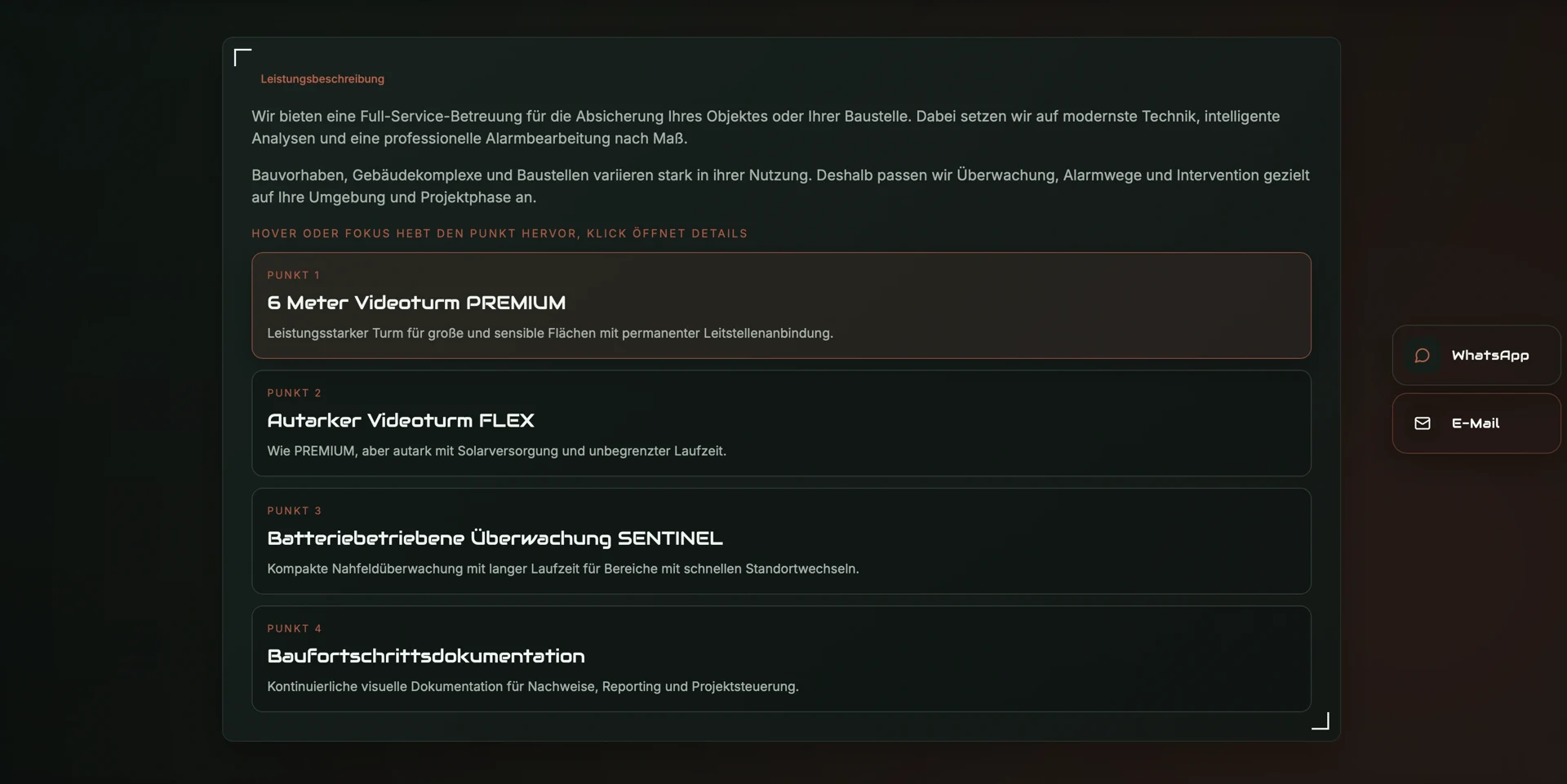
Services explained through their use cases
We organised NISTA-IT’s broad offering into dedicated service pages so visitors can start with the project they have in mind. Each page explains where a solution is used and how to get in touch, without requiring people to work through the entire range first.
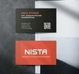
One identity across website and print
NISTA-IT needed to feel like the same brand on a construction-site banner and a mobile website. We developed its logo, colours and typography together, then translated them into reusable elements that connect the business stationery, navigation and service pages.
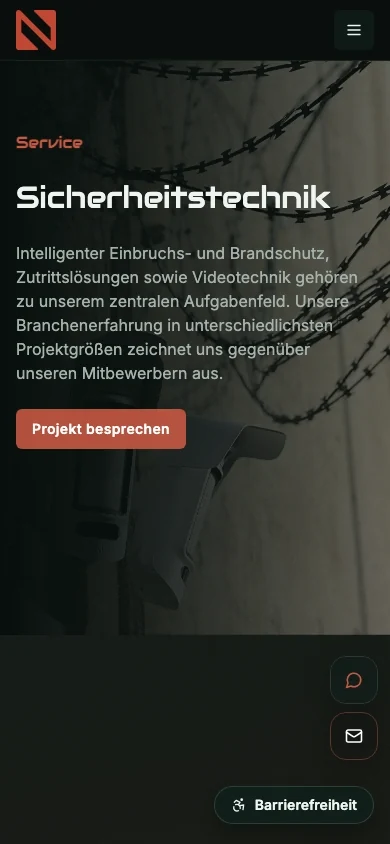
A shared system for new content
The website shares React components for navigation, language selection, FAQs and contact, with an Express backend supporting content management. German and English pages can therefore grow on the same foundation without rebuilding the design and functionality for every new service.
Four service areas, different questions
Access control for a building raises different questions from a mobile surveillance system needed only for the duration of a construction project. Energy management and network technology also need to be explained through their specific uses. We structured the website around these tasks rather than putting every solution on one long service page.
The individual service pages let visitors recognise their own project and read the information relevant to it. When comparing several solutions for the same property, they encounter familiar navigation and contact options: the content changes with the task, while the way through the site stays consistent.
From a construction banner to a mobile website
We began by considering the circumstances in which each brand material would be read. A construction-site banner has to communicate its key information from a distance, whereas a business card primarily needs to identify the company and provide contact details. The website offers more room to explain services, projects and common questions.
The logo, colours and typography hold these different formats together. On mobile, we arranged the content and navigation to keep service information readable and contact options within reach. The smaller layout serves the same purposes as the desktop site, with a design suited to the available space.
A reusable structure across the site
Service pages, company information, careers, contact and the blog all use the same components. We included language selection, FAQs and metadata in this shared structure so new content can inherit the existing design and behaviour as the website grows.
For ongoing maintenance, the Express backend supports a content layer where text and images fit into the established page structure. Shared functions can be developed in one place and made available across the relevant pages rather than recreated individually.
Inside the project
Design and technology in context.
React and Express connect a reusable interface to a lightweight content layer, alongside responsive design, technical SEO and the development of brand materials.
Visit websitePlanning something similar?
Tell us about your project. Together, we can work out where our design and development skills can support your team.
Discuss a similar project