RevierBlick GmbH
We designed brand materials and an investor brochure for RevierBlick GmbH. The documents need to give a quick impression during a meeting and make project details accessible on a later reading. Imagery and typography guide both uses.
- Challenge
- Present property projects convincingly for conversations with prospective buyers and investors.
- Our contribution
- Visual design, information hierarchy, brochure, project documents and business stationery.
- Result
- A consistent brand identity with project materials for digital sharing and print.
The most important information first
The brochure needs to convey an initial impression during a conversation and explain project information when read later. We balanced large images, headings and explanatory text so readers can gain an overview first and then move into the details that interest them.
A visual language across formats
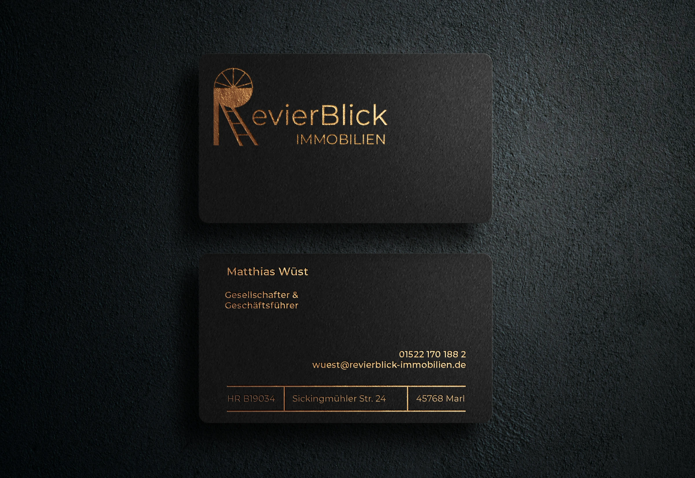
Dark areas, gold accents and shared typography connect the brochure, business cards and project documents. We developed these features across the different formats so materials remain recognisable as part of RevierBlick’s identity even when shared separately.
Prepared for sharing and print
From image crops to the order of information, we prepared the materials for their intended use. This includes digital versions for viewing and sharing as well as production-ready print files, allowing the design to be used in both forms.
A brochure for different depths of reading
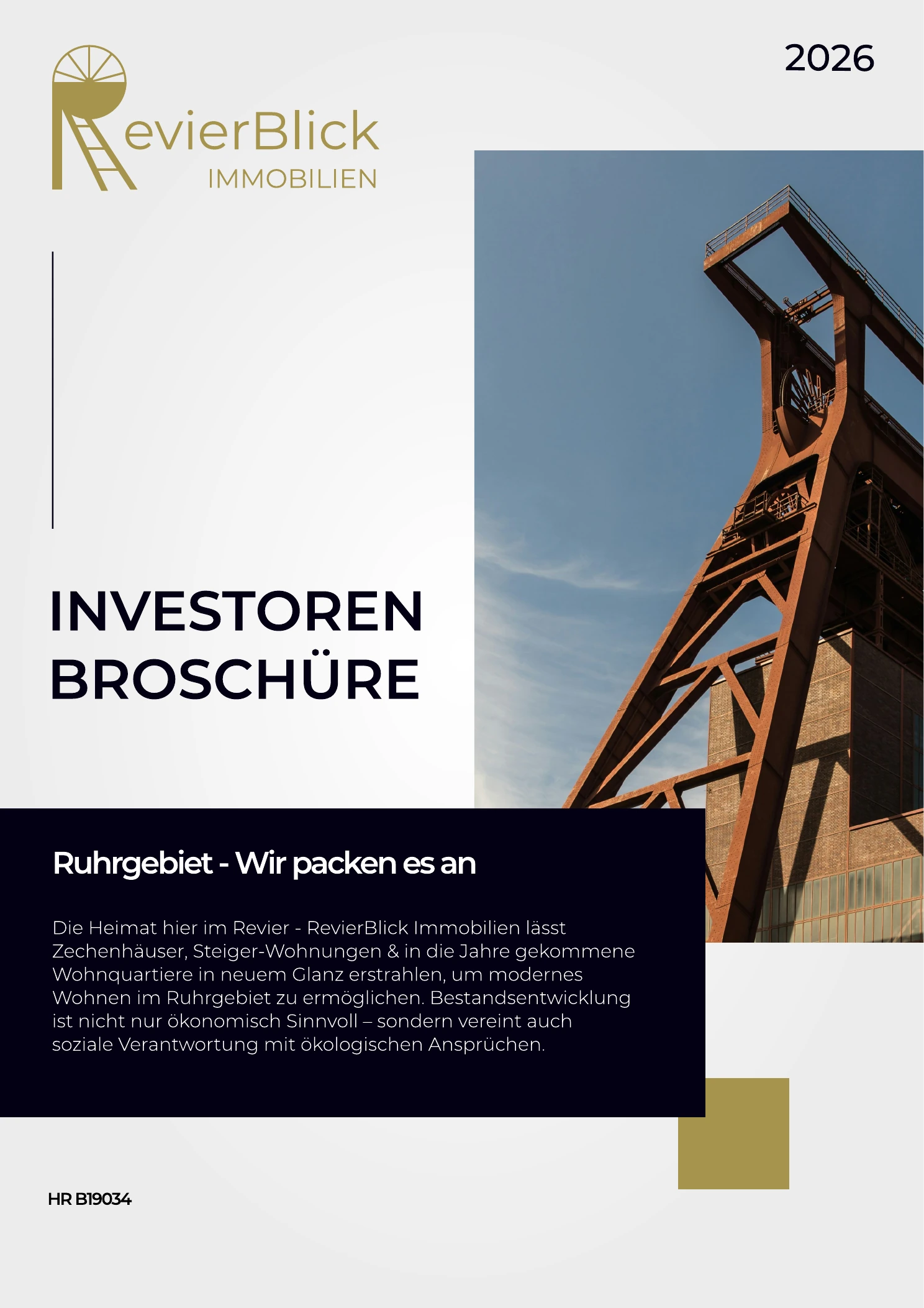
A brochure may be skimmed during a conversation, then read carefully later or reopened to answer a particular question. We designed the cover and large-format images for that first encounter and positioned the headings to guide readers into the explanatory project text.
Dark areas give prominence to key statements, lighter areas make room for longer text, and gold accents connect the pages to the brand. We balanced these changes with the amount of information on each page so the brochure supports both a quick overview and a closer reading.
Project documents in context
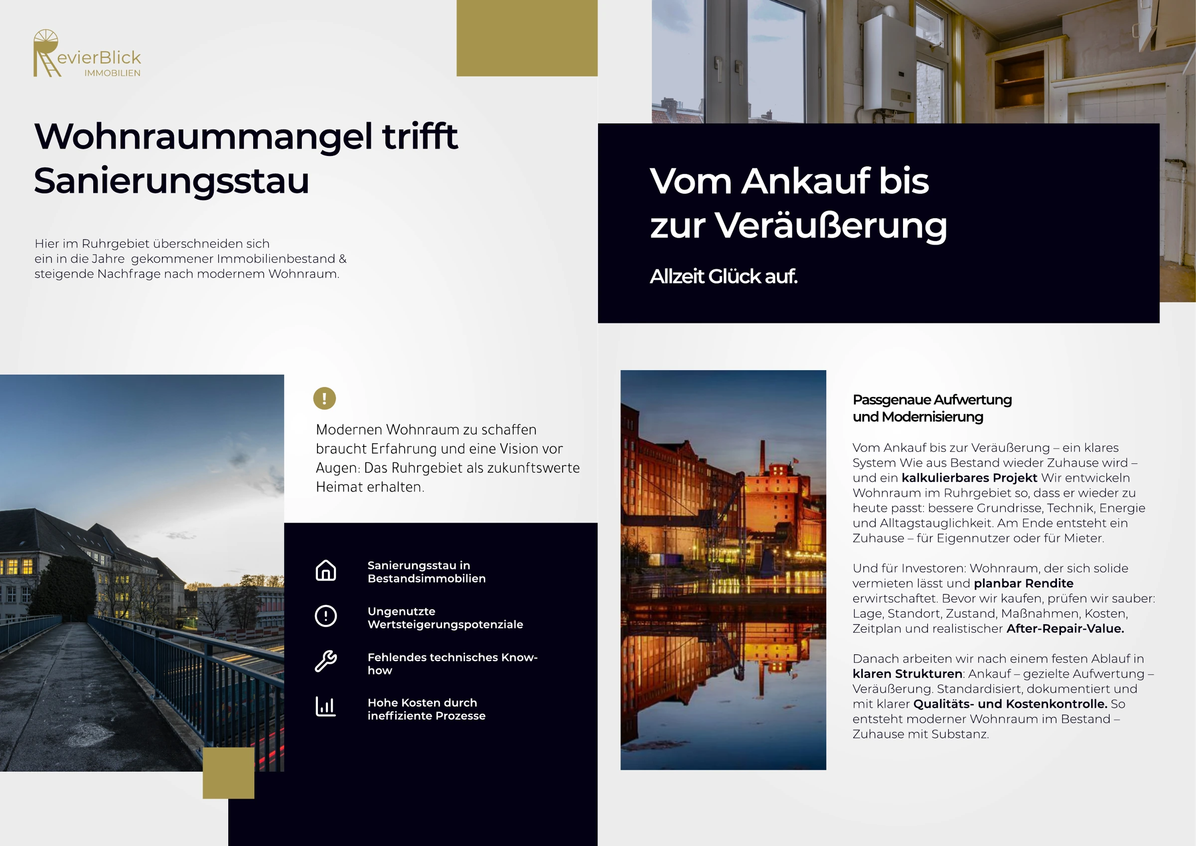
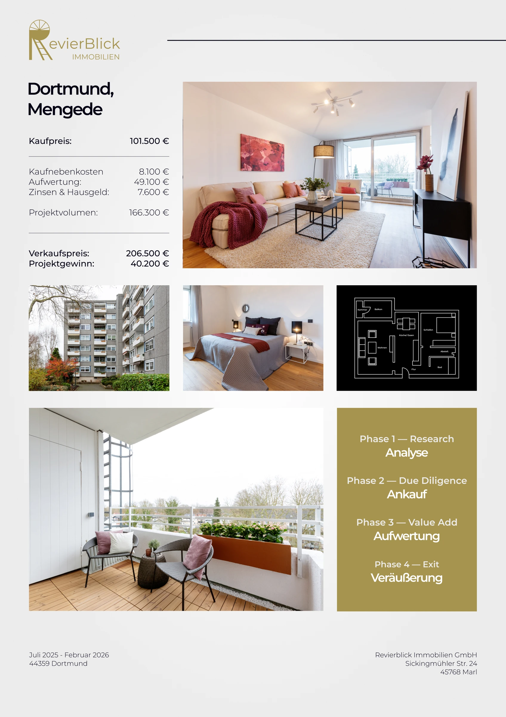
Images and descriptions need to work together in the individual property documents: the visuals convey a sense of space, while the text explains the accompanying information. Recurring brand features connect these documents to the brochure and preserve that relationship when a single page is shared on its own.
Our contribution covers the visual and editorial preparation of these materials. We coordinated image crops, sizes, spacing and type weights, then carried the design principles into the business stationery. The individual documents become part of a shared identity for different business conversations.
From layout to print files
Brochure design continues beyond the screen because the format and image quality must also suit production. We prepared the documents through to print and adapted the identity to the sizes and information needs of business cards and other project materials.
We accounted for the different uses in the handover: the digital version is intended for viewing and sharing, while the print file is prepared for production. Both exports give RevierBlick suitable materials for presenting projects in the relevant business and sales conversations.
Design and technology in context.
Brand design, editorial design, image preparation and prepress. The design connects the brochure, business cards and project communications.
Planning something similar?
Tell us about your project. Together, we can work out where our design and development skills can support your team.
Discuss a similar project