For a service business, conversion optimisation often starts long before the contact form. Visitors need to recognise whether the offer fits their situation, understand how working with you would proceed and see what they can do next. Someone choosing a class makes a different decision from a person trying software or looking for support with a larger project.
CRO therefore needs a connection between your visitors’ intentions and the outcome your website should enable. Our work with Hundeschule Hopen and medienkundig illustrates different ways of making that connection. Experience from a large e-commerce platform adds another lesson: the next useful action earns its place in the interface through the way people actually use the product.
Identify the next meaningful step in your service
Which action counts as a conversion follows from your business model and the decision visitors are trying to make. A relevant enquiry may be the goal for a service provider, while a class organiser needs confirmed participation and a learning product aims to guide people into an exercise and its explanation.
Having that goal in mind makes the optimisation brief more precise, because “We need more clicks” reveals little about the intended change. If visitors need to find suitable training and continue to date selection, you have already described a connected journey that design and development can improve together.
For example, Google Analytics treats lead enquiries and registrations as different events. That distinction is useful when improving the product: you can distinguish starting an action from reaching the outcome that matters for your offer.
What Hopen explains before the first personal conversation
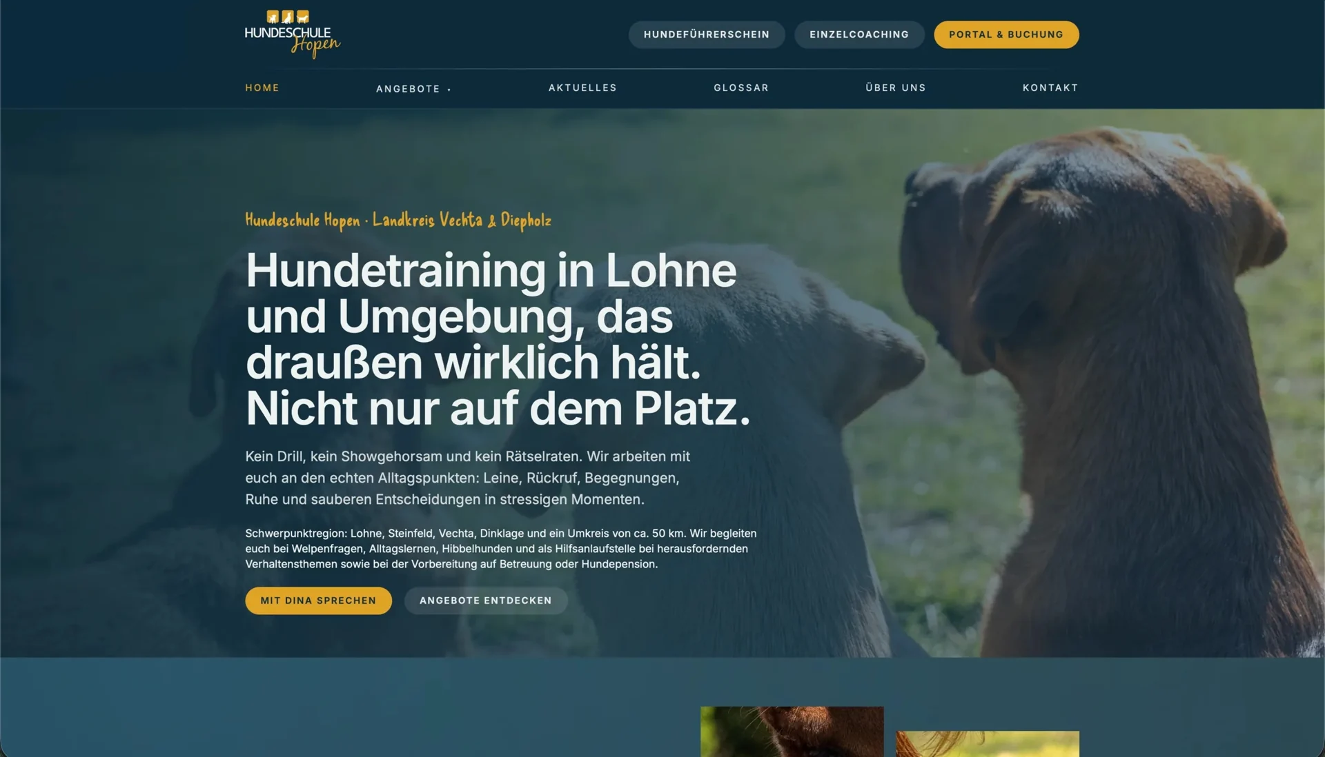
For Hundeschule Hopen, we connected training offers with dog owners’ everyday situations, helping people relate concerns about encounters or recall to suitable formats. Original photography introduces the school’s approach, while the glossary supports visitors in understanding unfamiliar terminology.
The website therefore provides part of the guidance before booking: visitors can explore the service and relate it to their own situation before using personal details in the connected portal. With its growth in organic reach, the content also reaches more people through search, giving them a place to prepare for the subsequent booking journey.
For another service business, the same thinking applies to questions that arise before an initial conversation. A prospective client might want to know whether you improve existing systems, which materials you need and what an initial assignment involves. Our article on relevant website enquiries examines how this information prepares the contact journey.
Research shaped the entry journey at medienkundig
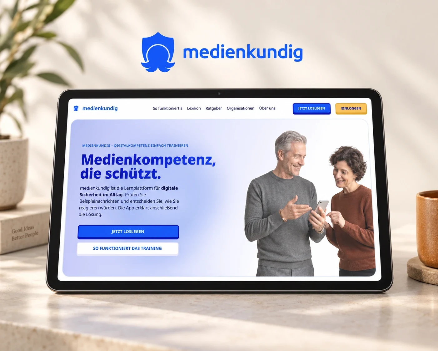
For medienkundig, we translated a survey and written expert interviews into product requirements. These informed exercises around everyday digital experiences, in which people can assess a suspicious message and discover the purpose of the learning product through using it.
Feedback about the entry experience also led us to change the sign-in sequence: people begin with an exercise and can then save their progress through passwordless sign-in. The account gains a purpose within the learning activity they have started, which we explain in the interface and carry through into implementation.
This sequence matters for service CRO because readiness for the next action varies: some visitors want to arrange a conversation immediately, while others first need to try a task, see a work sample or select a class. When the website responds to that decision, it can explain more clearly what taking the next step enables.
Search behaviour can change priorities in the interface
Our team’s e-commerce experience includes deciding how much prominence to give different routes into an offer. When working on a platform with around €200 million in annual revenue, we examined shopping journeys and identified the economic importance of search through usage analysis. That finding informed its prominent position in navigation.
We designed header variants and aligned search, categories and personal areas with people’s navigation journeys. After the released floating header was introduced, project feedback reported that a larger share of visitors continued from the entry page into the shop. The anonymised project account explains the design decisions behind that change.
For a service website, the transferable lesson is to give space to the route people actually need for their decision. A broad programme of classes may need a focused selection journey, while an advisory service may need a clearly explained starting offer. Usage and the offer determine that weighting, rather than placing the same contact prompt on every website.
Make the improvement work on a specific task
To review a design with a clear purpose, the team needs a shared task: prospective participants might need to choose suitable training and an available starting point, while people using a learning product need to complete an initial exercise and understand its explanation. Giving that task to members of the relevant audience lets them show how they find their way through the design.
Pay attention to the decisions along the way: what information does someone look for, how do they interpret a link, and what do they expect on the next screen? If participants expect an immediate booking but the next step is an enquiry, the discussion about changing a button has a concrete reason and the team can align the wording and journey with it.
When deciding which tasks to address first, we consider their importance, supporting evidence and implementation effort together. Our article on a CRO roadmap explains how that becomes an ongoing programme of work. Existing content and technical systems provide the basis for the next focused improvement.
Choose a suitable starting point for working together
A useful CRO brief describes the journey and its intended outcome: from a training offer into a portal, from a first example into further use, or from a service explanation into a relevant enquiry. Screenshots, recurring questions and existing reports help us agree where to begin.
Our enquiry review examines how understandable an offer page is and how its contact journey works. If you need to compare workflows or explore a different sequence, usability testing or a user journey and prototype offers a useful starting point. We can then plan design and implementation around the service your customers actually use.