A call to action connects an explanation with the next activity. Someone has read, compared or made a choice; the next click should help them move forward. The button label therefore needs to communicate what happens immediately afterwards and which part of the task that action completes.
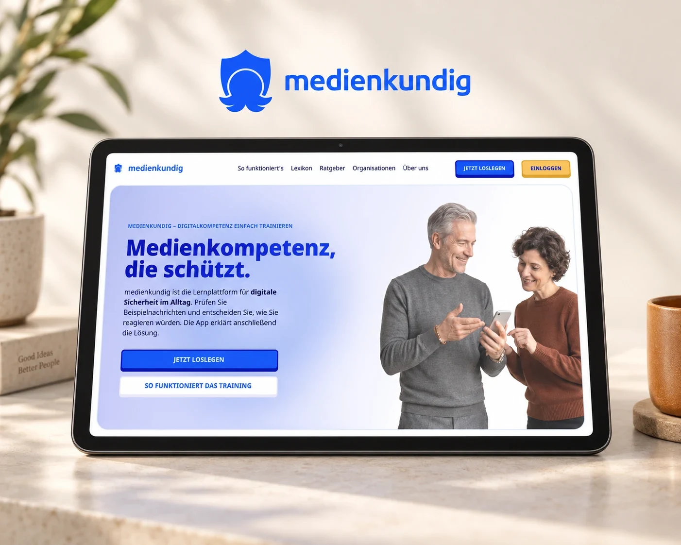
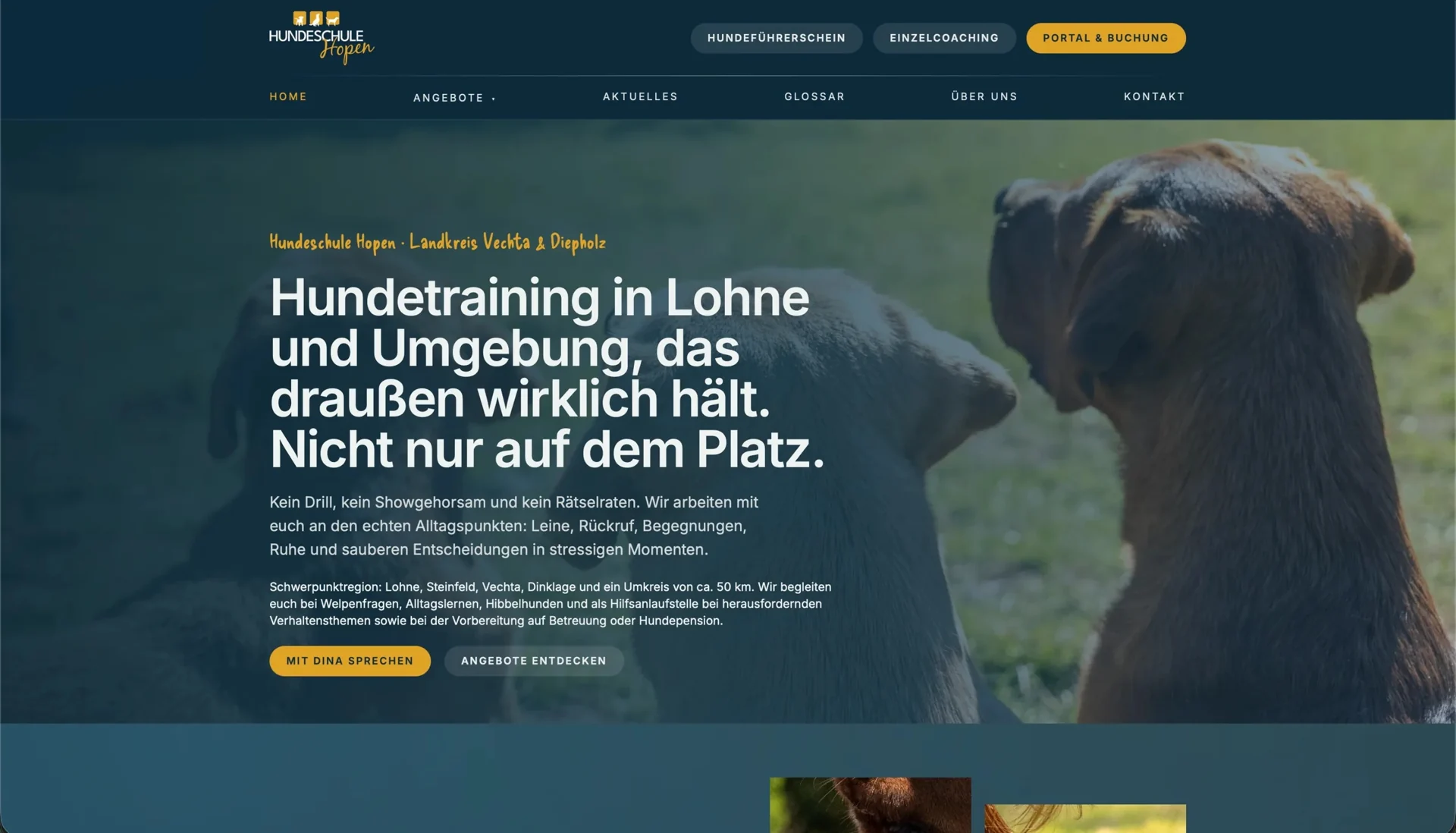
Our work on medienkundig illustrates the connection between wording and workflow: feedback about accounts shaped both the label and the timing of sign-in. At Hopen, the expectation created by training information needs to continue into the booking portal, while our e-commerce experience shows how much space an important action needs within navigation. For conversion optimisation, examining these relationships is more useful than searching for a particularly forceful verb.
Describe the next step so people can picture it
“Learn more” can lead to a useful explanation. Close to a specific decision, however, it often leaves people wondering whether the next view contains a form, a list of dates or an invitation to speak to someone. As visitors progress towards their goal, a description of the actual next action becomes more useful.
Suppose someone has already selected a training class: the label should make clear whether they will next view dates, request a place or confirm a booking. The appropriate wording follows from the next screen and the outcome of the click, which therefore need to be considered together.
The GOV.UK Design System’s button guidance recommends describing the action performed. Discussing design, wording and functionality together helps your team find a suitable label that communicates what the journey actually enables.
At medienkundig, the account has a practical purpose
For medienkundig, we used a survey and written expert interviews to develop learning activities around situations people recognise from everyday digital life. People begin with a concrete exercise in which they make a judgement and can relate the explanation that follows to their own answer.
Because the word “account” raised early concerns about personal data, we placed the exercise before registration and explained passwordless sign-in through saving learning progress. The action gains its purpose from the activity already underway: people explore the training and can subsequently connect their progress with access to the product.
The CTA expresses an existing benefit that the changed sequence makes possible to experience. Our article on registration after experiencing value explores how wording and workflow fit together during the transition from a first exercise to a personal account.
Develop the label within the context of the page
To find a suitable label, we also consider the information around the button: what has the heading promised, and what has the text already explained? Details about duration or the next contact can appear beside the action to clarify what the person still needs to know before continuing.
At Hundeschule Hopen, public training pages explain the available services through dog owners’ concerns. Original photography and a glossary help people understand the offer, while the connected portal handles accounts and appointments. Within this arrangement, selecting a date needs a different label from accessing bookings already made.
Consider a beginners’ class: the page explains who it is for, while the link leads into the available choices. Its wording should announce that continuation. Our article on moving into an external booking system explores how the class page and portal work together.
Give the most relevant action a recognisable place
If three equally prominent areas offer an enquiry, a download and a newsletter at once, visitors must first work out which route supports their goal. Emphasising the most relevant action and placing supporting routes where people need them connects the task of the page with a recognisable next step. The label receives visual emphasis that matches its function.
Our team’s e-commerce experience includes work on a platform with around €200 million in annual revenue, where usage analysis highlighted the economic importance of search. That finding informed header variants in which we aligned search, categories and personal areas with the ways people navigated the platform.
After the floating header was introduced, project feedback reported that a larger share of visitors continued from the entry page into the shop. The anonymised project account shows how that priority was expressed in the interface. For another website, the useful question is which action matters most in the current situation and where people expect to find it.
Keep the action coherent across screens
When a page invites an enquiry, the following screen should pick up that intention through a suitable heading and confirmation. Wording such as “Your enquiry” continues the same activity in language people recognise, helping them interpret the journey and move forward.
For links, that relationship also contributes to accessibility. The W3C explanation of link purpose describes how text and context communicate an understandable destination. Repeated actions should therefore have recognisable names, while different outcomes deserve distinguishable labels.
In our work together, we record the CTA alongside its target state. For a portal, that might be the date overview; for a learning product, saved progress; for a service, a submitted enquiry. System messages and confirmations continue the same action. Our article on clear interface messages provides further examples of that continuity.
Check whether people understand the action as the team intends
To understand the expectation a CTA creates during usability testing, ask participants to choose an offer and describe what they think will happen before clicking. Observing whether the following screen matches that expectation and whether they finish their task gives you practical feedback about understanding that can inform the design.
Later analysis can add evidence about how people use the journey: for an enquiry, we follow the progression from starting through submission to subsequent handling; for a learning product, from the initial exercise through its explanation to continued use. This also gives work on the label a direction, because its role can be assessed within the context of the service.
If your buttons attract attention but their function still needs explaining, we consider wording and workflow together. Our interface copy service develops suitable actions, feedback and states, while usability testing shows how people interpret them. The result is an interface whose next steps make sense within the task people came to complete.