People usually open an application to accomplish something: assess a suspicious message, find a suitable class or try a service. Creating another account rarely belongs to that plan, so registration at the entrance asks them to invest trust and time before the value of the product becomes tangible.
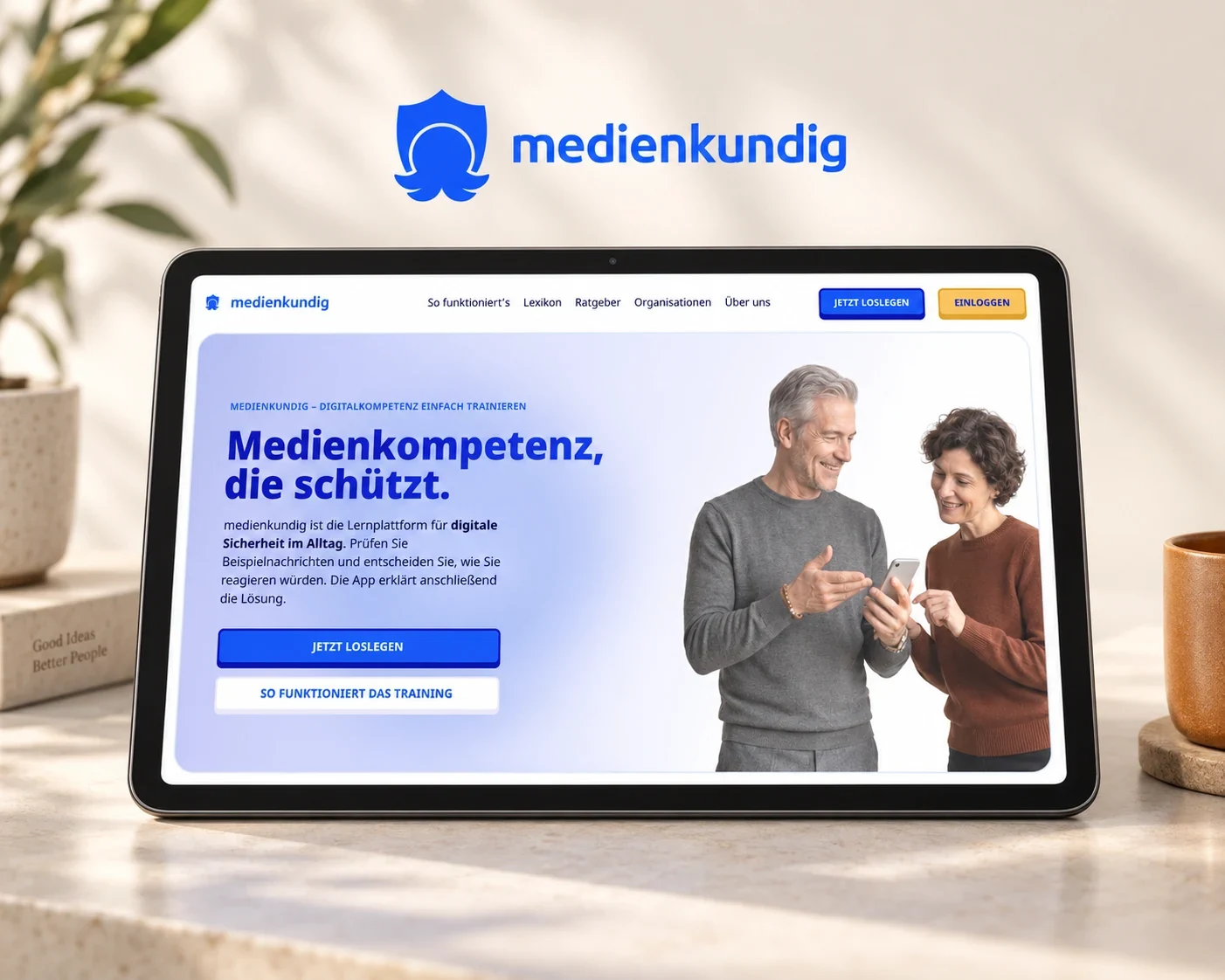
This makes the registration boundary a useful place to investigate during conversion optimisation. The important questions are when an account becomes necessary, what concerns signing up raises and what it actually enables. Our work on medienkundig shows how closely those questions are connected to the design of the product itself.
Why registration is difficult to explain before people experience any value
An email and password form may look straightforward to a development team. New visitors have other questions: will their details be stored, does the service cost money, will they receive messages later, and do they need it at all? When the application is still hidden, they have little information with which to judge that effort.
NN/g’s research on login walls describes the friction of requiring registration at the entrance. For your product, this creates a practical design task: show what people can do without signing up, and introduce registration where its purpose follows from the activity they have started. A private personal dashboard needs a different access boundary from a public example.
What feedback changed at medienkundig
For medienkundig, we connected a survey and written expert interviews with product development to build learning activities around everyday digital situations. People practise identifying suspicious messages and responding to them, so the introduction needs to make clear how the training relates to their own experience.
Feedback about the entry journey revealed that, for some members of the target audience, the word “account” raised questions about personal data before the purpose of registration was clear. We therefore placed exercises before registration and explained passwordless sign-in through saving learning progress, bringing the sequence and its wording together around a practical benefit.
This connection matters when commissioning an improvement, because changing the button label alone would have left registration in front of the experience. We therefore redesigned and implemented the journey so people can first explore the product and subsequently connect the learning they have started with their account.
Make a useful part of the experience genuinely available
By completing a learning task, people experience making a decision and receiving an explanation. That makes the product’s purpose tangible and gives meaning to the later offer to save their progress, whereas a list of features would only describe the experience.
Suppose an advisory application offers an initial assessment but displays only a registration request after someone enters their information: the visitor is still waiting for the value that brought them there. A useful initial interpretation would fulfil that expectation and create a reason to explain the additional possibilities of an account. The next decision would then build on something the visitor has experienced.
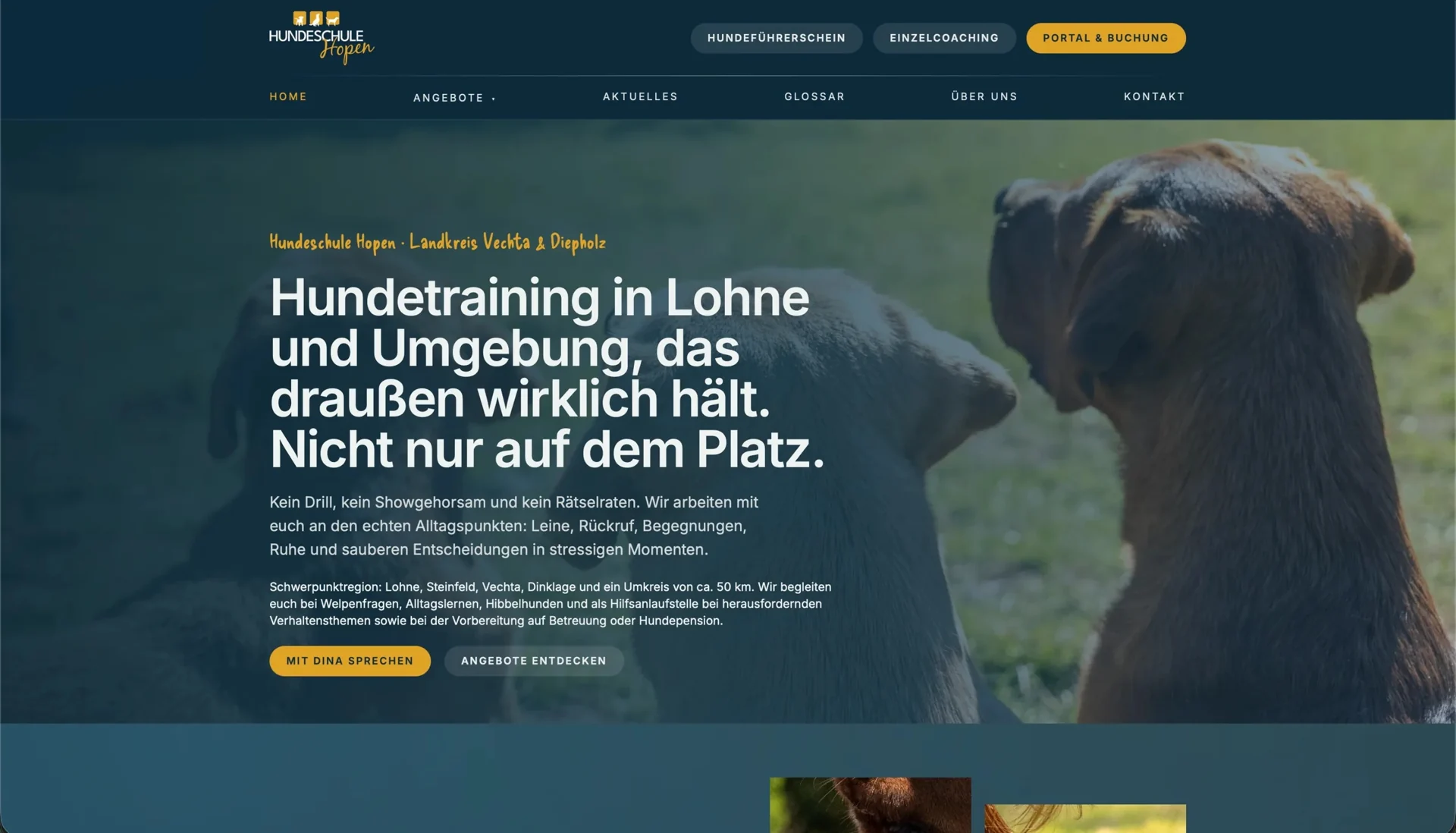
The public pages for Hundeschule Hopen explain training options through dog owners’ everyday concerns, helping them identify a suitable starting point before entering the connected booking portal. Accounts and appointments become relevant there, once visitors have explored the offer. Choosing training needs different information from completing an exercise, but both journeys begin by giving people enough context to understand their next step.
Continue the activity when signing in
When sign-in appears later in the journey, it should carry forward the work already done. During implementation, we therefore agree which choices, entries and results will be preserved. When someone returns from an email, the application also needs to make it apparent where their activity continues.
At medienkundig, the learning journey connects trying an exercise with subsequently saving progress; another application may need to preserve a selected class or a draft. To provide dependable feedback, design and development must agree which state is actually retained and appears again after sign-in. Our article on clear system messages explores how to communicate that information.
Include interruptions in the design, such as someone opening registration, changing their mind and returning to the original task. Reviewing these transitions shows whether the open entry experience also works when people take a different route through it.
Signing in provides access to personal bookings
Signing in protects appointments, documents and settings that people want to access again when they return. Explaining that purpose through the task itself makes the reason for access apparent, whether someone wants to view a booking, reopen a document or continue learning.
For a booking portal, this might mean making the class description and entry requirements understandable on the public website while keeping personal bookings in the account area. At Hopen, orientation and account management are distributed between the website and the portal in this way. We examine that transition in the article on moving into a booking portal.
Our team’s experience on an e-commerce platform also involved examining the practical role of a personal area. Usage analysis informed concepts that connected account activation with specific activities: finding suitable products for a boat, adding a product to their own inventory or preparing for a season. Within the design, signing in therefore relates to something a person wants to accomplish, rather than appearing as an isolated function alongside shopping.
Evaluate the task and what happens afterwards
“More accounts” is too narrow as the sole goal for a new version. For a learning product, it also matters whether people start an exercise, understand its explanation and find their progress again later. For a class provider, the question is whether visitors choose the right class and continue the booking journey they have begun.
Usability testing shows how people complete these tasks, while later analysis reveals where they continue or leave the journey. Together, they help you assess registration in relation to the actual goal, such as a completed booking or returning to use the product. For the wider planning of an entry journey, see our article on onboarding in UX design.
When registration obscures the value of a product, we start with the audience’s experience and the existing journey. A user journey and prototype makes a different sequence tangible before implementation is commissioned. The discussion then moves beyond removing form fields to a practical decision about how people discover and continue using your product.