You have explained the first step, added a prominent button and described the main benefits alongside it. During a usability test, you can watch how someone connects those elements: does their gaze move from the heading to the explanation and then towards the relevant action? Eye tracking lets you follow that sequence, adding a view of what happens before a click to your observation of the interaction itself.
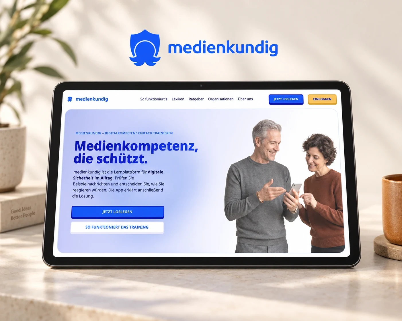
The recording from the medienkundig project shows a gaze overlay on a website and its learning application. It offers a concrete way to explain how eye tracking works in UX research and how a recording helps you ask more precise questions about a design. The benefit is a stronger basis for decisions about reading order, explanations and interaction.
How eye tracking records gaze on a screen
In screen-based eye tracking, a sensor estimates where a person is looking. Common systems use invisible infrared light and cameras to capture the positions of pupils and light reflections, from which software calculates a gaze position on the screen. Before the session, the participant follows a few calibration points so that this mapping fits their eyes and seating position. Tobii explains the process through the technology used in its sensors.
Analysis maps those positions onto the interface, connecting brief pauses known as fixations with the rapid movements between them, called saccades. How that sequence is presented depends on the question you want to explore: a gaze replay shows it over a screen recording, a gaze plot summarises it as dots and connections, and a heatmap combines the distribution of gaze over a selected period or across comparable sessions.
For design work, a useful question is which information someone looks at before making a decision and in what order. When click data shows that a person opens a learning path, for example, the gaze recording adds whether their gaze first falls on its description or moves between several options.
What you can see in the medienkundig video
In the first embedded excerpt from medienkundig, the marker moves between the introductory copy on the homepage and the actions below it. The second excerpt takes you into the learning application, where learning paths appear on the left and an explanation of the selected unit opens on the right before the journey continues to an exercise with several possible answers.
The movement between overview and detail is particularly useful to watch. You can follow when the marker sits within the list of learning paths and when it moves towards the explanation beside it. A general impression of a page becomes an observable sequence that a team can watch and discuss together.
This earlier version of the interface provides a concrete design on which to follow gaze movements and pause individual moments for discussion: what information is available at that point, which action follows, and how do they relate? Considering the excerpt through those questions keeps the connection between interface and behaviour in view.
A useful research question gives the recording a purpose
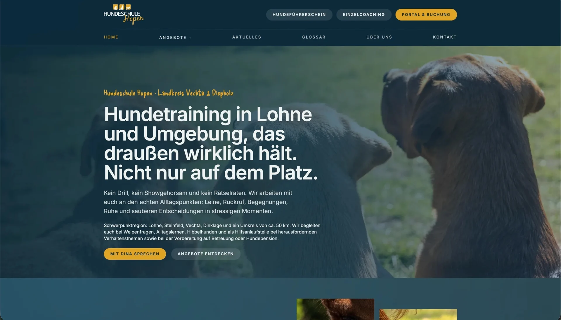
When investigating a class page, a question about the next decision is more useful than a general opinion about its appearance. On a website such as Hundeschule Hopen, you might explore how someone chooses a suitable class for a young dog. That involves the training description, entry requirements and the route to booking. A realistic task lets the participant decide how to proceed.
The task determines which parts of the interface deserve attention. For Hopen, those might be the suitability information and the handover to the booking portal; in a learning application, the selection of a unit and the start of its first exercise. These examples illustrate two useful applications of the method. The medienkundig video lets you follow part of the latter journey.
A simple comparison shows why task wording matters: while “Find the blue button” directs attention towards a particular design element, “You want to find out where to begin” leaves room for the actual search. Nielsen Norman Group’s research on tasks and gaze behaviour shows how strongly a person’s goal affects which information they examine.
Connect gaze movements with actions and explanations
During analysis, we consider the gaze sequence alongside the visible interaction and the participant’s explanation. If their gaze moves repeatedly between a heading and a button, a useful follow-up is to ask what they expected at that moment. That helps establish whether clearer wording, a nearby explanation or a more coherent grouping would support the decision.
Discussing these moments together using the recording after the task gives the participant a specific point of reference from which to describe what they were looking for. This is also the basis of retrospective think aloud, in which a replay prompts a conversation about how someone approached the interface. A study by Cho and colleagues describes the combination in an evaluation of a health application.
That conversation also gives context to a longer look at a paragraph: the person might be carefully comparing information or searching for a particular detail. Their explanation helps the team understand the observation and use it to decide on a suitable change to the design.
Turn observations into changes to the user journey
The analysis should identify the part of the experience you want to change and the decision that the design should support. If someone repeatedly opens the details of several learning options to find their duration, for example, showing that information in the overview could help them choose. The design then answers the question at the point where it matters to the decision.
At medienkundig, the same perspective helps with everyday digital terms that form part of the learning material itself. Their explanations should be reachable from the current exercise and lead back to the same point, so people can use the new information in their decision. Our article on explaining terminology within an interface explores how the content and interaction work together.
For the team, the decision becomes concrete when the observation, relevant recording and proposed change are kept together. Designers and developers can understand why a hint moves closer to an option or a heading becomes more specific. A further session lets you observe how people use the revised journey.
When eye tracking is a useful choice for your project
Eye tracking is particularly useful when you want to understand visual orientation more closely: around detailed product information, comparable services or an important entry point into an application. It helps a team discuss attention in context and organise the interface around the task at hand. A short excerpt with a clear explanation also helps stakeholders understand the reasoning behind a design decision.
Your starting point is the question you want to answer. In a usability test, we investigate how people use a relevant journey. When visual attention is the central research question, we agree the use of eye tracking and suitable equipment together. The observations inform concrete changes to content, arrangement and interaction, which we bring together in the user journey and prototype.
Eye tracking at medienkundig
Read the video description
Red circles and connecting lines overlay the screen recording. On the homepage, they move between the introductory text and the buttons below it. After a cut, the learning application appears, with navigation on the left and learning paths in the centre. An explanation of the selected unit opens on the right; the marker moves between these areas. The recording ends with an exercise asking what a domain is. The marker moves across the answer choices.