Someone reads a course description, gets stuck on a training term and opens a search engine. On returning, they first need to find the point where they were trying to make a decision. A single unfamiliar word has created another task, even though the purpose of your page was to help them choose a course. Good contextual help keeps the explanation close enough for the original train of thought to survive.
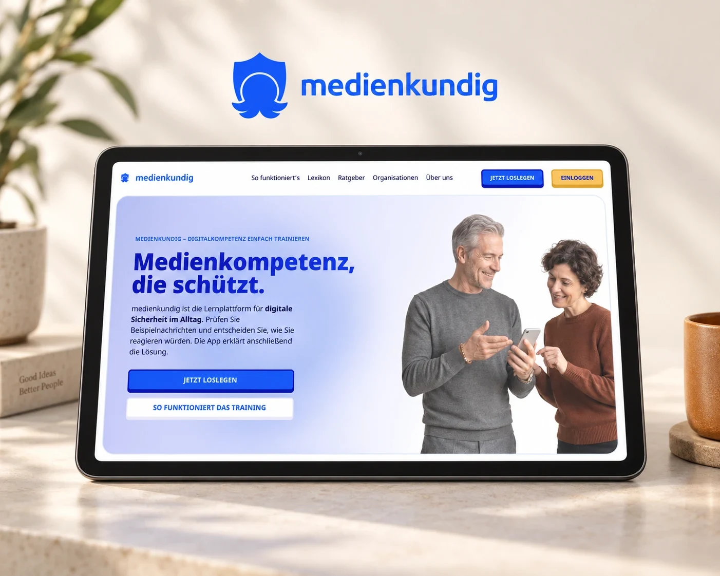
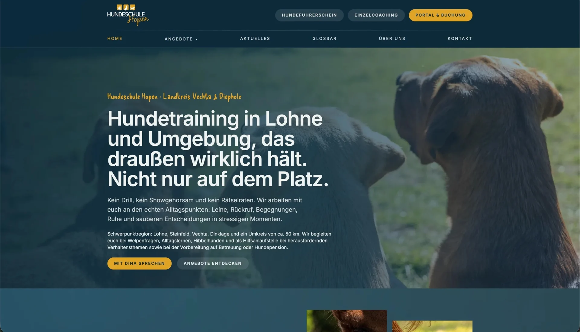
At medienkundig and Hundeschule Hopen, we encounter the same design question in different specialist fields: what do people need to understand before they can continue? The learning product deals with everyday digital situations, while the dog school helps owners choose suitable training. That question determines which terms need explaining and where the explanation belongs.
Clear writing comes before the glossary
We start with the main text, checking whether a familiar expression already explains the subject accurately. Specialist language remains useful when it describes an important distinction that people will encounter again. A glossary then helps them understand the term and recognise it when it appears in later content.
Hopen’s course pages start with situations dog owners recognise, such as difficult encounters with other dogs or an unreliable recall. The concern becomes clear before the training format is explained in detail. We connect the specialist name with the situation the course addresses and use the glossary for further explanation. This gives the term a place within the description instead of expecting it to provide all the orientation by itself.
An explanation should serve the current decision
A dictionary entry explains what a word means. Contextual help should also make clear why the word matters at this point. Someone reading about a suspicious message needs more than a definition of phishing: they need to understand which features of that message are worth checking. The explanation leads back to the original task so they can continue with what they have learned.
At medienkundig, reference content and exercises form a connected learning environment: people assessing a situation can look up unfamiliar terms and use the explanation to continue their task. For other applications, the lesson is to shape help around the question the current activity raises. A general catalogue of every feature would be too far removed from what the person needs at that moment.
The W3C explanation of unusual words describes ways to make definitions of specialist language and unusual uses of words available. For your product, choose a form that suits the length of the explanation and the device people are using.
Separate a short definition from deeper reading
A brief explanation can often sit directly beside the term. If it needs images, several examples or distinctions between related concepts, a dedicated page is easier to read. The shorter help text can establish the meaning and then point to the full entry, leaving the reader free to decide how much detail they need.
Suppose a course description uses a term that new dog owners may not know. A short explanation beside it could show how it relates to the training situation and link to a fuller entry describing the approach and typical questions. We develop the wording with the people responsible for the service so that it remains accurate and answers the question raised by the term as someone reads.
Choosing the right names for main navigation involves a different set of questions. If visitors cannot find the service within the structure, a glossary farther down the journey will do little to help. Our article on testing navigation and categories covers that earlier decision.
Let people return to the same place
Help is only fully designed when the way back works as well. After closing it, people should be able to find their unfinished sentence, selection or task again. A dialog therefore needs an identifiable title, a clear way to close it and a predictable return to the element that opened it. A small panel and a separate page involve different return journeys, so that distinction belongs in the design work.
This connection matters particularly on a phone. If a definition fills the screen, returning should preserve the reading position. Opening an explanation should not discard data already entered in a form. We examine these transitions as part of the task because otherwise the help itself introduces a new obstacle.
To make the help usable with a keyboard and assistive technology, people need to be able to open it through an accessible, clearly named control. An explanation that appears only when a mouse moves over a word would prevent that access. We agree how the information opens and closes with the frontend team, then check the behaviour in the component being used.
Keep terminology connected across the website and application
Hopen’s public information leads into a connected booking portal. The name of a course needs to remain recognisable across that transition, even when the interface changes. In a learning product such as medienkundig, the same relationship exists between an explanation and a task: a term should not mean something different in an exercise from what the reference entry describes.
A shared editorial record helps the team maintain this consistency by keeping each term’s agreed spelling, concise explanation and places of use together. When a service changes, the associated descriptions can then be updated as a group. Suitable components and clear ownership help preserve that relationship in everyday content maintenance.
The following task shows whether the help works
During a usability test, we are interested in what people can do with the explanation after reading it. Can they choose the right course, assess a message with a reason or continue the activity they started? A high number of help openings does not answer that on its own. It initially tells you that the help is being used.
A useful comparison follows the same task before and after a revision. Observe which terms prompt questions, whether the explanation is understood and whether returning works. The resulting improvement may concern the help text, or it may begin with the main description. Our interface copy service connects clear language with the actual user journey, while a usability test examines how the explanation works for your audience.