A website can look familiar and still leave an important question unanswered: what happens if I continue? Someone who rarely uses digital services wants to understand the next step before entering personal details or confirming a selection. A useful interface explains that step in relation to the task at hand and lets people work at their own pace.
Even people with considerable subject knowledge can encounter an unfamiliar digital process. Someone may understand their dog’s needs but have never booked training online, while another person uses messaging on a phone every day and is trying an interactive learning application for the first time. Familiarity depends on those particular experiences, so age or occupation alone tells you little about how someone will approach your product.
Recognisable tasks provide a dependable starting point
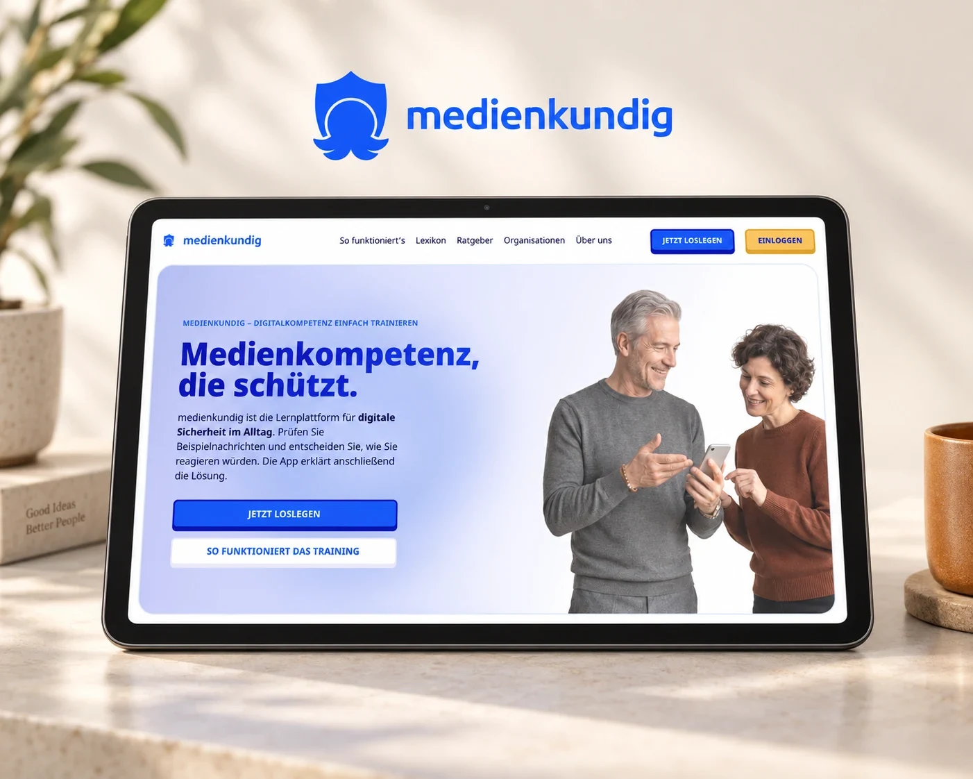
At medienkundig, we connect digital safety with situations people recognise from everyday life. A survey and written expert interviews provided the basis for this approach. Experiences of attempted deception became tasks in which people can assess a message themselves and then understand the relevant clues. The purpose of the application becomes apparent through using it.
We shape the interface around what people are assessing and the decision that follows from it. A feature belongs at the point where it helps them work through that task or continue afterwards. Our article on onboarding looks more closely at a person’s first contact with a product; here the focus is on maintaining orientation throughout the following activity.
Maintain familiar patterns throughout the journey
Once someone has understood an action, they should be able to carry that knowledge into the next step. Recurring functions therefore need recognisable labels and dependable positions. The W3C explanation of consistent identification describes this relationship for functions that appear more than once. It also helps when moving from a course description to a selection and then a booking: the course name remains the shared point of reference.
Within a longer task, the current step needs a name that helps people recognise their position and build on what they already understand. Someone selecting an appointment, for example, needs to see the available dates alongside the training they have chosen. Carrying that selection visibly into the following screen lets them concentrate on the next information they need to provide.
Terminology belongs in that continuity as well. At medienkundig, we connected the purpose of signing in with saving learning progress. Our article on showing value before registration explores that entry point in more detail. Across the whole journey, the wording and the views that follow it need to fulfil the same expectation.
Connect information with the action it prepares
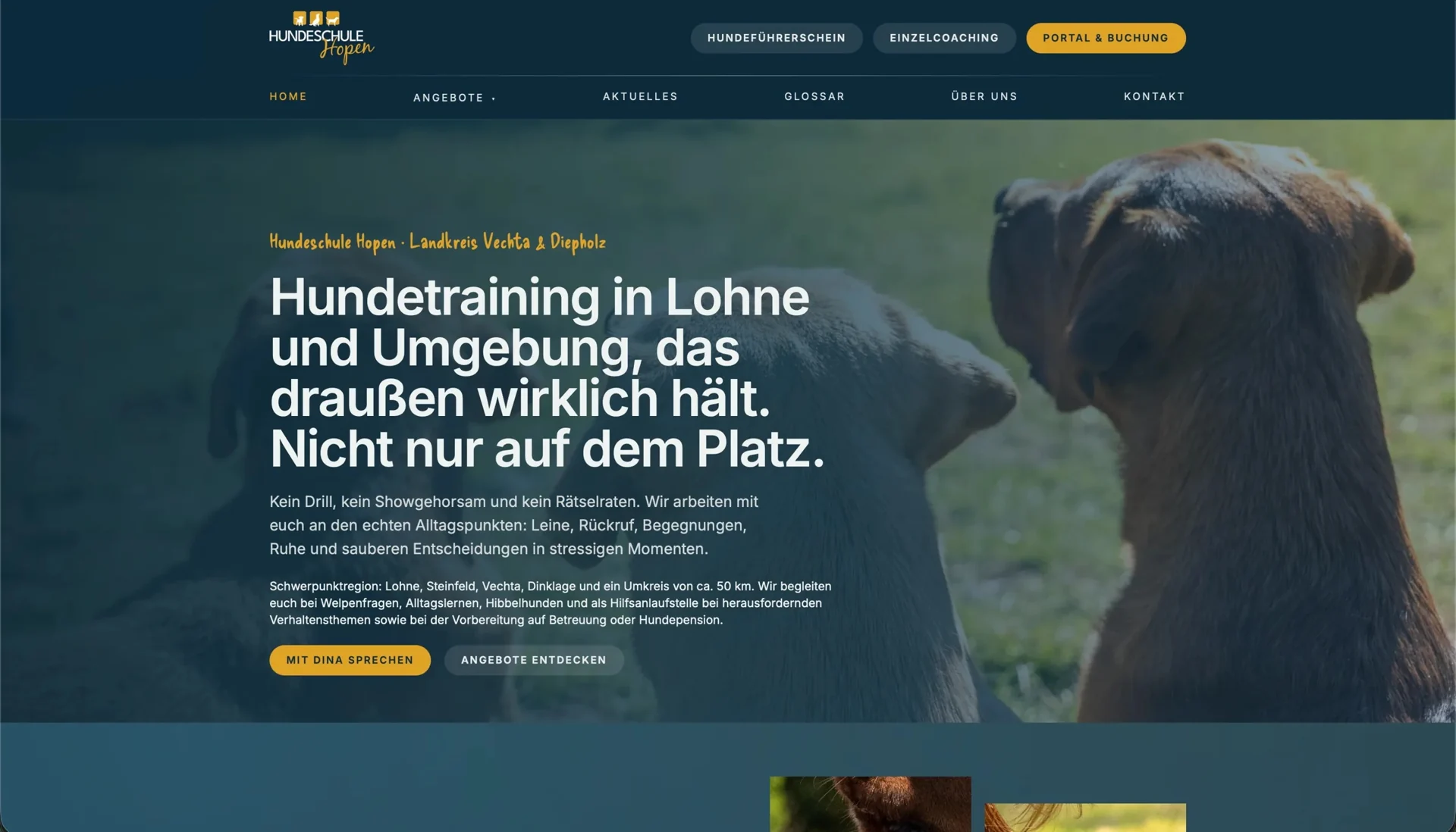
At Hundeschule Hopen, the public website starts with the concerns dog owners bring to training: course descriptions explain the everyday situations each course addresses, while personal photography introduces the work. Anyone wanting to understand an unfamiliar term can look it up in the glossary before continuing to the connected booking portal.
We treat that transition as part of the same activity. Someone who has found a suitable course wants to recognise it at the next step and understand what is needed to get started. Familiar names and an identifiable route into the portal connect the explanation with the action. The same principle applies to appointment booking, customer areas and service enquiries: a move between technical systems remains one continuous undertaking for the person using them.
Keep decision-making information together on a phone
A smaller screen reveals whether the order of your content suits the task: someone who recognises a service through its heading should be able to read what it is suitable for and see the next step immediately afterwards. Keeping that information together also makes it easier to return after an interruption, because the person can pick up their decision without piecing together several distant sections.
Our team’s experience with an e-commerce platform provides another relevant lesson: frequently used entry points need visible priority. Analysis brought search to the foreground as an important way into the product range. The released floating header keeps search and other central routes available. According to project feedback, a greater share of visitors subsequently continued from the entry page into the shop. The experience connects information hierarchy with the journey that follows it.
For your product, the design decision begins with the actual task. A learning exercise, a course search and a search for spare parts require different information, but each needs a dependable link between understanding the page and taking the next action. The precise dimensions of controls are then checked in the components being used; our article on usable mobile links covers that detail.
Make the next move clear through feedback
After an action, the interface should explain the state the person has reached. In a learning application this concerns their answer and its explanation; in a booking journey it concerns the selected appointment and the information still needed. A useful next action follows from that state and shows how the activity continues.
Because people put a phone down, get interrupted or read an explanation again, we also design how they return to the task. A retained selection, recognisable task heading and clear return route give them a way to pick up where they left off. Technical saving and error messages have their own writing considerations, covered in our article on system messages. They are still grounded in the state the application has actually reached.
Test the journey with the people who will use it
A suitable usability test follows a recognisable goal, such as finding a relevant course and reaching its booking page. As the person works independently, we examine their expectations of the next screen, their questions and the points where they seek confirmation. Returning after a short interruption can form part of the same activity.
The observations show where to revise the journey, perhaps by moving an explanation closer to the selection it concerns or naming a transition more clearly. Repeating the same task then lets us examine whether people find that information and continue without an additional explanation. The quality of the guidance can be assessed through the activity itself.
Our user journey and prototype service connects the task your product supports with a concrete interface. A subsequent usability test examines how the revised guidance works for the people it is intended to serve.