When feedback explains why an answer was right, people take something useful into their next decision. They can recognise the decisive clue and understand how they reached the result. In an interactive learning application, that explanation belongs to the purpose of the activity itself: it makes the reasoning behind the tick understandable.
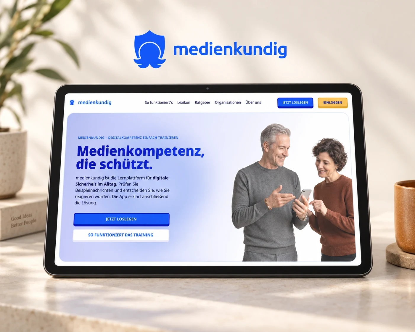
At medienkundig, we developed this connection between a task, a person’s selection and explanatory feedback as part of a learning product. People work through situations from everyday digital life and compare their assessment with the explanation that follows. We focus on making that explanation connect with the thinking they have just done themselves.
Start with the selection the person made
Feedback is easier to follow when its relationship with the preceding action remains visible. After assessing a message, a person needs to see the relevant clues and their own selection in a connected context. They can pick up the same train of thought without reconstructing the task from memory. The same applies to a selected product variant and the reason a comparison tool recommends it.
Matching exercises at medienkundig display connections between cards. While working, people can see which elements they have linked and complete their selection before the full set is checked. This visibility is itself part of the feedback: the interface shows how the system has received the person’s choices and provides a clear point of reference for the explanation that follows.
Explain the idea someone can use again
In a suspicious message, the decisive clue might concern the relationship between the sender, the request and the linked address. Explaining how that relationship appears in the message gives people a way to approach a similar situation next time. The explanation stays close to their particular selection so they can follow the reasoning for themselves.
Consider an exercise in which a message pressures someone to provide personal details quickly. Useful feedback could explain which part creates that pressure and how the requested action could be checked. The person leaves with a way of approaching the next decision. A general warning about every danger on the internet would introduce a much broader subject than this particular task needs.
The design therefore begins alongside the content of the exercise. We establish which observation needs explaining and develop the selection state and feedback together. Technical saving, loading and error messages have their own writing considerations, explored in our article on clear system messages.
Make progress meaningful through its context
A progress indicator supports orientation when it relates to the completed activity and shows where someone can resume a learning journey. At medienkundig, saving that progress is also the explained purpose of signing in. People can connect the value of the function with an activity they have already started.
The same product question applies elsewhere: which work of their own can people return to? A saved comparison, for example, gives a personal area a tangible purpose because the information already examined is available on the next visit. The following action can build on that work rather than sending the person back to a general home screen.
Connect the result with a relevant next action
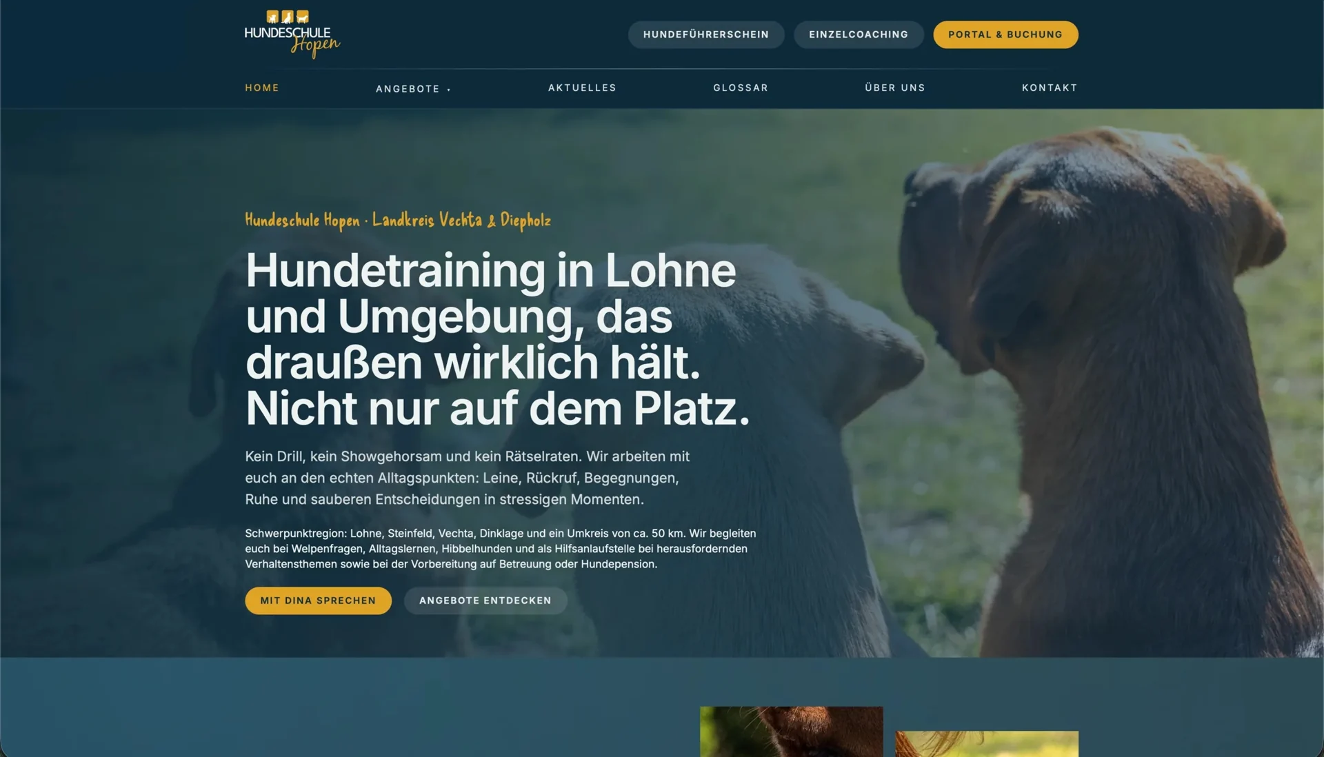
At Hundeschule Hopen, we connect understandable training descriptions with access to a booking portal. The public website prepares the selection, while the portal contains dog owners’ accounts and appointments. This continuous journey illustrates why useful feedback needs a clear relationship with both the previous decision and the next step.
In a booking journey of this kind, selecting an appointment needs a recognisable summary of the chosen course. For an enquiry, confirmation explains that the request has been received and how contact will continue. For a completed reservation, the confirmed appointment takes priority. Wording appropriate to the actual state makes the result useful and helps the person plan what to do next.
The W3C tutorial on form notifications also connects submission results with the relevant input. For a learning task, we extend that relationship through the content explanation: people need to recognise their decision and understand the response to it.
Design the explanation and the next attempt together
Someone who wants to try the task again after reading an explanation needs an identifiable entry point to apply the idea they have just understood. In a comparison product, the equivalent action might be adjusting a selection and looking at the result again. The explanation leads back to a decision the person can explore for themselves.
While designing the interface, we therefore follow the route from the explanation back to the activity and check which information needs to remain visible. On a phone, that journey often spans several screens. Selection, result and the next action need a recognisable relationship so people can refer to the reasoning as they continue.
Language and presentation work together here. An important explanation needs a persistent place, a meaningful heading and an identifiable relationship with the selection. Colour can reinforce the result, while text explains its meaning and the way forward. Unfamiliar terms can be supported by contextual help beside the expression.
Examine what happens on the next attempt
A suitable usability test lets people use the explanation themselves. We then look at how they justify a comparable decision and whether they can find the next attempt. This observation brings the evaluation closer to the purpose of the feedback than asking whether the interface looks friendly.
For each revision, we keep the task, the explanation and the following behaviour together so that a change to the wording or presentation can be examined directly. When people identify the decisive clue themselves and use it in the following task, we have a concrete criterion for assessing the explanation and deciding where the next revision should focus.
Our user journey and prototype service develops the relationship between an action and its result. Our interface copy service gives that explanation suitable language. The work at medienkundig and Hopen shows how different the subject matter can be while the same connection remains valuable: people understand their decision and see how they can continue.