When your Shopify store attracts visitors but few of them order, attention often turns to the buy button. The selection beside it may indeed be difficult to understand. But the campaign might also promise a different product, delivery costs may become clear too late, or a particular payment method may not work. A CRO audit follows the purchase journey and records the evidence behind each recommendation.
You need a specific shopping task, the relevant pages and somewhere to record your findings. The fillable PDF audit worksheet helps you separate what you observed, its possible effect and the next investigation. To adapt the structure for your team, copy the editable text template (Markdown) into your own document and work through it with design, development and the people responsible for the store.
Suppose you sell modular wall shelves. Customers choose the width, a wood finish and matching brackets; some combinations are ready to ship while others are made to order. A mobile ad links directly to the product page. Following this purchase gives us a concrete way to build an audit from the initial promise through to order confirmation.
Define the purchase you want to investigate
“Optimise the store” leaves too much open. For the shelf, the first review task is more specific: someone wants a shelf and brackets for a 90-centimetre alcove and needs to know when it will arrive before paying. That puts selection, accessories and delivery at the centre of the review. A gift purchase or a larger order for an office would raise different questions.
Record the starting point: which ad or search query leads to which URL? Which device, market and language belong to the task? If a campaign promises a shelf with brackets included, but the product page sells them separately, the problem begins before the cart. The relationship between the campaign promise and landing page therefore belongs in the investigation.
Start with one important journey that you can review from beginning to end. Add another product family deliberately, for example when it has different selection rules or delivery terms. This keeps it clear which findings apply to many products and which relate only to a particular variant.
Use analytics to focus the investigation
Shopify’s Conversion rate breakdown report lets you examine sessions with cart additions, sessions that reached checkout and sessions that completed it. Check the report settings too: open and closed funnels capture different paths. The rates for the stages use total sessions as their denominator; they are not automatically the transition rate to the next stage.
For this review, you might ask whether mobile visitors from the shelf campaign reach the cart less often than other visitors to the same product page. Compare similar periods and traffic sources where possible. A campaign change that brings more people looking for inspiration creates a different situation from a variant selector that has suddenly stopped working.
The numbers help you choose an area to investigate, but do not explain an abandonment by themselves. A low transition to checkout might point to unresolved delivery questions, while a technical error could produce the same pattern. If the measurement is inconsistent, resolve the counting rules in analytics and the store system before turning the result into a design brief.
You can also inspect a complete purchase without extensive analytics and document specific usability problems. Your assessment then rests on that journey. A screenshot alone does not let you calculate a percentage of supposedly lost revenue.
Product page: does the information support the choice?
Open the shelf page on an actual mobile device and start where a visitor from the ad would start. Can you establish whether the product fits the alcove, which parts are included and which version you are currently selecting? All the information need not fit on the first screen. It needs to be findable when the decision requires it and match the selected variant.
Change the width and watch what happens to the image, price, delivery time and bracket selection. If the image still shows the wide shelf while the selector says 80 centimetres, record that precise state. “Improve product images” would be too general; the finding concerns the conflicting information in the selection and its visual representation.
Accessories require the same clarity. If “brackets optional” sits beneath several collapsed sections, someone may only discover that a part is missing once they reach the cart. A useful change could explain beside the selection which brackets fit and whether they are included in the price. The article on Shopify product pages covers the detailed review of variants, images and product information.
Inspect states that a quick walkthrough can miss: an unavailable version, a failed attempt to add an item and a selection after going back. Look at whether the feedback explains what happened and how to continue. On a longer page, also check whether a sticky purchase bar identifies the relevant selection or shows only a price without enough context.
Cart: checking and changing the selection
Customers should recognise their decision in the cart. For the shelf, that means a clear summary of width, finish, quantity and brackets. If the line says only “Natural wall shelf”, you have to return to the product page to check the width. This extra journey is worth documenting because it can reopen a decision that the shopper had already made.
Change the quantity and remove an item. Do the price calculation and feedback work? If brackets remain in the cart after their shelf has been removed, it should be clear that they would now be purchased separately. Check these dependencies for discounts and bundles too, rather than inspecting only the first successfully filled cart.
Before checkout, customers also want to understand which charges and conditions remain. If delivery costs require an address, the earlier information should explain this clearly. “Shipping calculated later” may provide too little guidance for a large shelf when an existing delivery information page already gives specific conditions. Our article on delivery costs and cart abandonment looks at how to place that information in the purchase journey.
What you can inspect and change in Shopify checkout
Go through the journey with an agreed test address and the delivery and payment options intended for your market. Check that the selected shelf remains correctly summarised, the delivery option fits the order and errors are explained by the relevant field. Include returning from an error and correcting the input without losing the previous selection.
Before commissioning a change, establish where it can be implemented. Shopify separates the theme from checkout; according to Shopify’s availability overview, apps using UI extensions on the checkout’s information, shipping and payment pages require Shopify Plus. Other changes depend on app type, plan and market. Record the technical prerequisite alongside the finding before “this explanation is missing” becomes a request to “just add a field there”.
A complete functional review includes an agreed test order. Shopify’s test-order guidance explains test payments and checking the subsequent order processing. Coordinate this with the responsible person: while a payment provider is in test mode, customers cannot use it to place live orders. Afterwards, check that the order, confirmation and the follow-up processes intended for your store fit together, then return the payment provider to normal operation.
Write findings that someone can act on
A screenshot with a red circle marks a location but does not yet explain the work for development. Add the shopping task, steps to reproduce the issue and the expected relationship between the elements involved. Someone else can then open the same state and assess whether the proposed change addresses the problem.
A finding for the shelf might look like this:
| Part of the finding | Audit entry |
|---|---|
| Observation | After selecting 80 cm, the image still shows 120 cm; the cart summary does not include the width. |
| Evidence | Mobile URL, selected variant, capture date and two screenshots before and after adding the item. |
| Possible effect | Customers may be unsure which width they would order when checking their selection. |
| Proposed change | Show the current width by the image and in the cart line. |
| Next investigation | Trace the selection technically and test whether the summary is understood by appropriate participants. |
The possible effect remains a hypothesis until you investigate its basis further. The audience might barely notice the image change but read the dimensions carefully. They might overlook both. A usability test with a suitable task lets you observe the decision rather than speculate about the behaviour.
Decide what should be addressed first
Sort findings by their importance to the task and the strength of the evidence. A payment that cannot be completed calls for a different response from a suspicion about a button colour. For the remaining points, consider how often the state occurs, which buying decision it affects and the effort needed for the next investigation or implementation.
In the shelf example, a reproducible fault affecting a frequently ordered variant would first be a technical issue. The missing width in the summary is then a clearly defined change. Whether another in-use photograph helps can be examined separately. This ordering prevents a large image-production project from starting while the actual variant fault remains.
Give each selected finding an owner and an acceptance criterion. “Fix the width everywhere” becomes “The chosen width appears correctly after adding the item, changing quantities and reopening the cart”. That is more useful for both implementation and the subsequent check.
Repeat the same purchase journey after the change
After implementation, repeat the same shopping task. Include states that could have been affected indirectly: other widths, accessory combinations and the return from checkout. Link the new version in the audit and describe what now works. The report can then remain a working document after the initial handover.
Whether conversion subsequently changes is a question for comparable data and a defined investigation. A usability test or later analysis may be appropriate for an individual change; our comparison of A/B testing and usability testing explains how the available evidence informs that choice. A new campaign, discount and interface launched together cannot later be cleanly attributed to one effect.
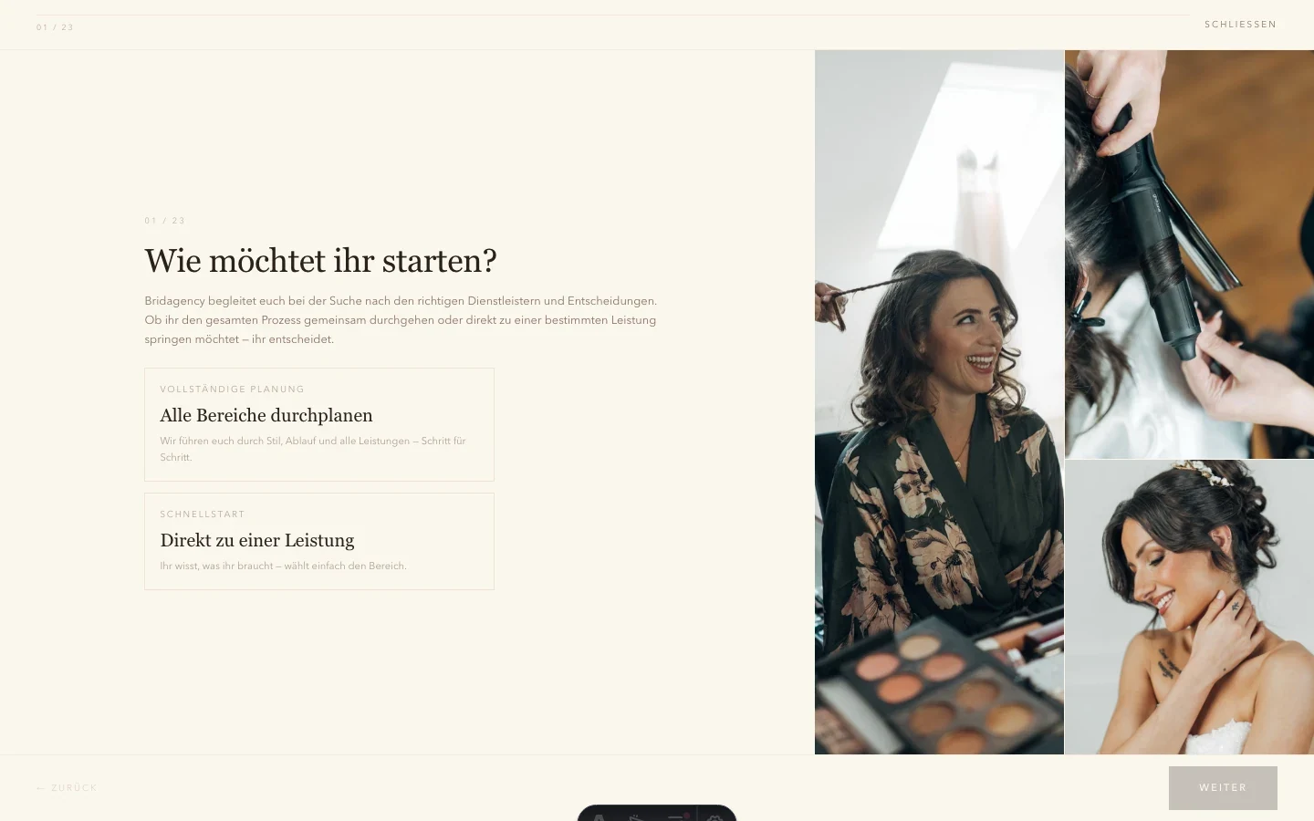
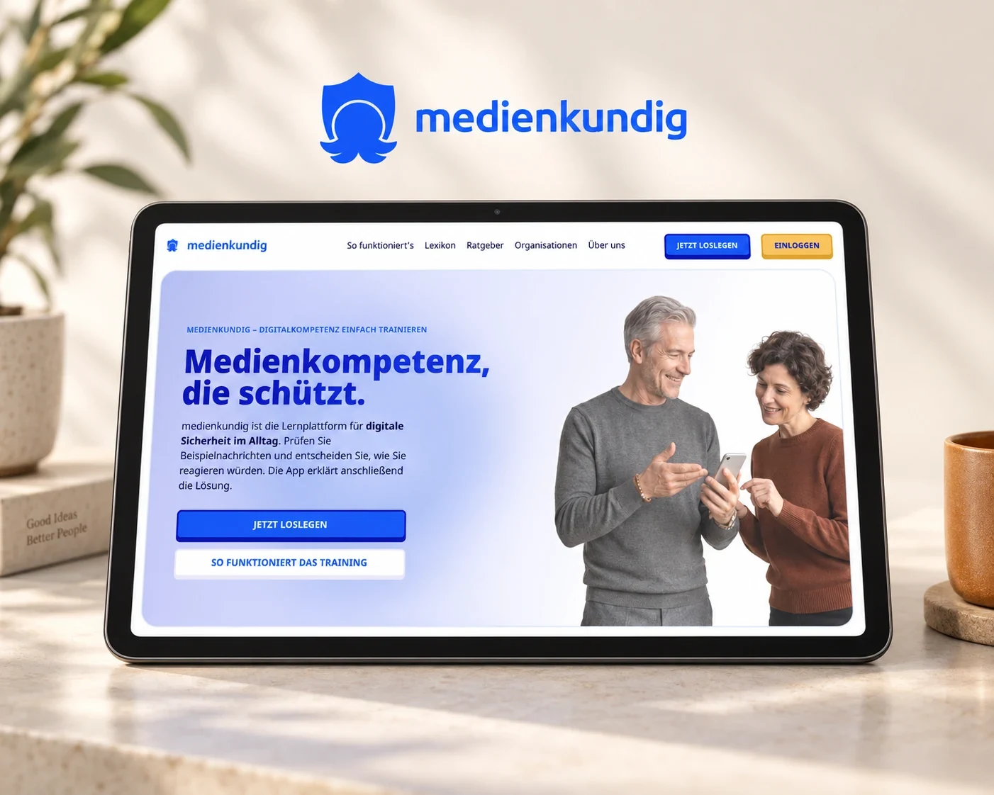
Bridagency and medienkundig show how we work on selection decisions and connected journeys. In Bridagency’s planner, inputs and budget depend on each other; in medienkundig, the introduction leads into an interactive task. Both projects show why transitions between views belong in design and testing.
If you want to start with a product page and its cart, our purchase journey check provides prioritised qualitative findings with annotated screenshots. It does not include a complete checkout audit, implementation or a user study. For a broader Shopify purchase journey, we agree the scope with you using your completed audit worksheet.